
Rahul Guleria
SEO Executive
Creative,
Branding
& Growth
in the Global
Digital Ecosystem
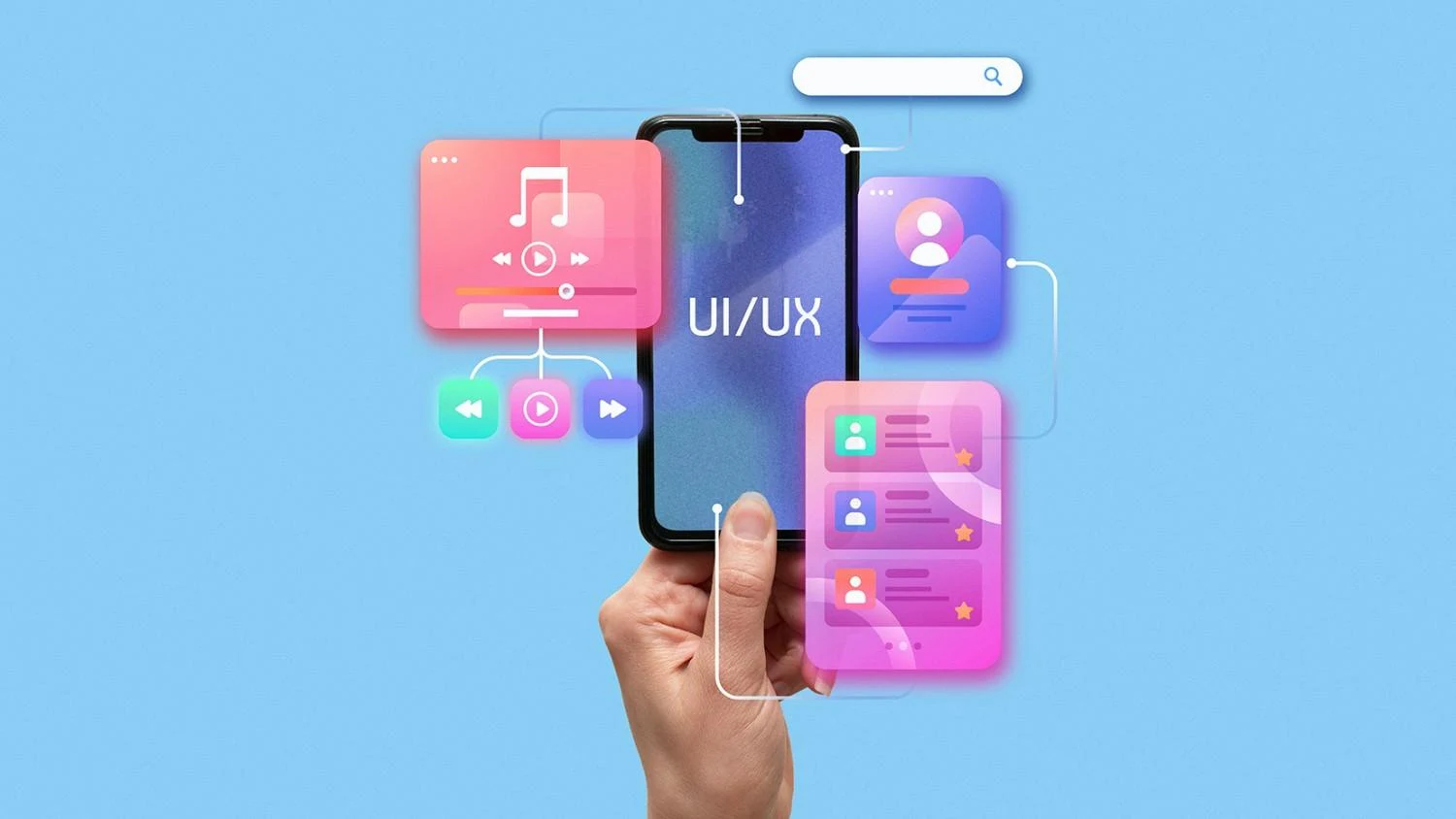
Optimizing website UI/UX for higher conversions means designing pages that feel intuitive, fast, and effortless to use. Clear navigation, strong visual hierarchy, fast-loading pages, mobile-friendly layouts, visible and compelling CTAs, consistent branding, and trust-building elements all work together to guide users toward action. When you follow user-centered design and combine it with structured testing, you naturally increase engagement and conversion rates.
Before you start hunting for landing page optimization tips, it helps to be crystal clear about what you’re actually improving.
UI is everything users see and directly interact with on your website:
● Layout and structure
● Colors and gradients
● Buttons and form fields
● Icons and imagery
●Typography (fonts, sizes, spacing)
Think of UI as the “visual layer” of your landing page design for conversions. It’s the first impression, the aesthetic, the polish.
UX is how your website feels to use from start to finish:
● How easily users find what they need
● How simple it is to complete a task (sign up, buy, download)
● How well your page answers user intent
● How much friction or frustration users experience
UX acts like the invisible guide that quietly nudges users from curiosity to action.
You can’t increase landing page conversion rate with just pretty visuals or just efficient flows. You need both to work together.
● A page with beautiful UI but poor UX looks good but doesn’t sell. Users get confused, lost, or overwhelmed.
● A page with great UX but sloppy UI might convert some users, but it will struggle to build trust and credibility at scale.
When you align UX and UI with your core offer and audience, you create a conversion-focused experience. That’s where Conversion Rate Optimization (CRO) comes in. If you want to go deeper into the strategy side, you can always explore What is Conversion Rate Optimization (CRO) for a strong foundation.
Let’s zoom out before we zoom in. These principles are the backbone of high-converting landing page design.
Confused users don’t convert. They bounce.
Your landing page should answer these questions instantly:
● What is this about?
● Is it for me?
● What do I do next?
To keep things clear:
● Use straightforward headlines, not clever riddles.
● Remove unnecessary sections, links, and distractions.
● Keep forms short and focused on only what you really need.
If your content doesn’t help users convert or understand your offer, it probably doesn’t need to be on the page.
Consistency builds trust. Trust power conversions.
● Use a consistent color palette, typography, and button styles throughout the page.
● Mirror your brand’s tone of voice in headlines, body copy, and microcopy.
● Make sure ad creatives and landing pages feel like one continuous story, not two different worlds.
When users feel that continuity, they’re more comfortable taking the next step.
Visual hierarchy is how you guide the eye.
● Primary elements: main headline, hero image, primary CTA
● Secondary elements: benefits, supporting visuals, trust badges
● Tertiary elements: footer links, additional information, FAQs
A strong hierarchy ensures your CTAs never get lost. Strategic landing page design for conversions builds the page around the CTA, not the other way around.
Most industries see a huge chunk (or majority) of traffic from mobile. If your landing page looks amazing on desktop but clunky on mobile, your conversion rate will suffer.
A responsive layout should:
● Adapt to different screen sizes without breaking
● Keep CTAs visible and thumb-friendly
● Maintain legible text and good spacing on small screens
Mobile responsiveness isn’t a “nice to have” anymore. It’s one of the most important CRO tips for landing pages.
Speed is a silent conversion killer.
Even a delay of a few seconds can spike bounce rates. A slow landing page makes users doubt your tech, your reliability, and sometimes even your legitimacy.
Improving load speed helps:
● Reduce drop-offs
● Improve user satisfaction
● increase the potential for higher conversion rates
A landing page that’s hard to read or navigate will never reach its conversion potential.
● Use adequate contrast between text and background.
● Keep font sizes readable on all devices.
● Use headings, subheadings, bullets, and short paragraphs.
● Ensure links and buttons are large enough to tap easily.
Inclusive design doesn’t just help people with disabilities. It makes the experience easier for everyone, which naturally helps you increase the landing page conversion rate.
Website UI/UX Best Practices
Now let’s get into the tactical landing page optimization tips you can apply right away.
Your landing page shouldn’t feel like a full website. It should feel like a focused journey.
Best practices:
● Use clear, minimal menus. If you’re running a campaign, consider a stripped-down header. Keep only essential links (like “Home” or “Contact”) or even remove the top navigation entirely for dedicated squeeze pages.
● Limit top-level menu items. Too many choices create decision fatigue. Limit navigation to the few most important options so users don’t stray from your core objective.
● Use breadcrumbs on multi-step flows. For longer funnels (like multi-step forms), breadcrumbs reassure users: “You’re here, next is this, and you’re almost done.”
When users never feel lost, they’re more likely to stay and convert.
Your CTA is the action you want users to take. The rest of the page exists to support it.
Make CTAs:
● Action-oriented Use verbs that reflect value:
○ “Get My Free Audit.”
○ “Start My Trial.”
○ “Book a Strategy Call.”
● High contrast and visible Buttons should stand out from the background and surrounding elements. Users shouldn’t have to hunt for them.
● Placed multiple times strategically. Place CTAs:
○ Above the fold in the hero section
○ After key benefit sections
○ Near social proof or testimonials
○ At the end of the page
This keeps the “next step” always within reach, no matter where users are on the page.
Aligning CTAs to user intent is a core part of conversion rate optimization. When you’re ready to treat this systematically rather than ad hoc, you can explore Conversion Rate Optimisation services to build a more rigorous CRO roadmap.
Visual hierarchy is one of the most underrated landing page design tactics for conversions.
Ways to implement it:
● Highlight what matters first. Your main headline, subheadline, and primary CTA should dominate the hero section. Secondary information can sit below.● Use whitespace strategically. Whitespace isn’t wasted space. It creates breathing room, separates sections, and strengthens focus on key blocks.● Keep key elements above the fold. Above-the-fold content should clearly explain:
○ Who you are or what the product is
○ The primary benefit
○ The main action
Users will scroll if they see value upfront.
● Use consistent heading styles. Make sure H1, H2, H3 sizes and styles are consistent so users instantly understand the structure.
Instead of treating mobile as an afterthought, flip the script and design mobile-first.
Mobile UX best practices:
● Responsive layout: Use flexible grids and components that stack naturally on smaller screens.
●Thumb-friendly CTAs and controls. Place primary CTAs where thumbs naturally rest (usually lower center or right on mobile). Make buttons large enough with adequate spacing so users don’t tap the wrong element.
● Avoid tiny text. No one wants to pinch and zoom. Use font sizes that are comfortably legible.
● Hide secondary elements behind accordions FAQs, extra details, and secondary content can live inside collapsible sections so the page doesn’t feel endlessly long.
If you’re wondering how to improve landing page conversions quickly, fixing mobile UX is often one of the fastest wins.
You can’t talk about UI/UX without talking about speed.
Practical speed improvements:
● Compress images. Large, uncompressed images slow pages dramatically. Use modern formats (like WebP, where supported) and compress images before upload.
● Minify CSS and JavaScript. Remove unnecessary whitespace and comments, and combine files where appropriate.
● Use browser caching. Caching lets returning visitors load your pages much faster by storing assets locally.
● Use a CDN (Content Delivery Network). A CDN serves content from servers closer to your users, reducing latency.
Even small technical tweaks like these can instantly help increase landing page conversion rate because fewer users leave due to slow load times.
Your landing page is part of a broader brand ecosystem. It shouldn’t look like it belongs to a different company.
Branding best practices:
● Align colors with your brand identity. Use your primary and secondary brand colors intentionally. Reserve your strongest accent color for CTAs.
● Keep typography consistent. Limit yourself to one or two font families. Use consistent hierarchy across headings, subheadings, and body copy.
● Use a consistent brand voice. Whether your brand is friendly, authoritative, or playful, keep that tone consistent in headlines, CTAs, form labels, and microcopy.
Consistency removes friction and builds trust, which makes every click on your CTA more likely.
Users constantly assess risk. “Can I trust this brand?” If the answer is “I’m not sure,” they hesitate.
Trust-building elements:
● Customer testimonials and reviews. Short quotes with names, roles, and photos (where possible) add authenticity.
● Case studies or success metrics Show concrete outcomes: “Increased leads by 40% in 3 months.”
● Logos of clients or partners. If you’re allowed to showcase logos, place them near the hero or social proof sections.
● Badges and security icons. Payment security, privacy assurances, money-back guarantees, and certifications all help reduce anxiety.
● Clear policies. Links to refund, privacy, and terms pages in the footer make users more comfortable sharing data or payment info.
These signals reduce perceived risk, which is at the heart of effective landing page optimization tips.
No matter how good a design looks inside a design tool, real users decide if it works.
Practical ways to test and learn:
● Use heatmaps and scroll maps. Tools like Hotjar or Crazy Egg show where users click, hover, and drop off. You can spot dead zones, ignored CTAs, and sections that attract attention but don’t convert.
● Watch session recordings. Replay real journeys to see where users hesitate, rage-click, or abandon forms.
● Perform A/B tests. Try different headlines, CTA copy, layouts, form structures, or hero images. Test one major change at a time so you know what drives uplift.
● Run simple on-page surveys. Ask short, targeted questions like “What stopped you from signing up today?” and use that feedback to refine UX.
This is where UI/UX meets proper CRO practice. If you want a strategic framework rather than random tests, pairing UX improvements with structured conversion rate optimization via a partner like PulsePlay Digital gives you a repeatable process instead of guesswork.
Sometimes it’s easier to improve by avoiding the biggest pitfalls. Here are UI/UX mistakes that quietly destroy landing page conversion rates.
More content doesn’t mean more conversions.
● Too many messages at once
● Multiple conflicting CTAs
● Excessive pop-ups or banners
All these create cognitive overload. Users leave instead of deciding.
If users can’t clearly see what to do next, they won’t take action.
● CTAs that blend into the background
● Generic text like “Submit” or “Click here.”
● Only one CTA at the very bottom of a long page
These are easy to fix but often overlooked.
A beautiful, animated hero that takes 8 seconds to load on 4G is a conversion killer.
● Heavy videos auto-playing on mobile
● Oversized images
● Excessive external scripts
Remember: on many mobile networks, “fast” on your desktop connection can still be “slow” in the real world.
When fonts, colors, and button styles keep changing, users subconsciously feel something is “off.”
● Different button designs for the same action
● Random color switches between sections
● Mismatched imagery or illustration style
The experience feels unprofessional and harder to trust.
Users should never wonder, “Where am I?” or “What just happened?”
● Links that open unexpected pages
● Multi-step forms with no indication of progress
● No feedback after submitting a form
When flows feel confusing or broken, users drop off even if they were ready to convert.
You don’t need an endless tool stack. A focused set can take you far.
● Figma / Sketch Great for designing responsive layouts, creating design systems, and collaborating with designers, marketers, and developers.
Use them to:
● Build wireframes and high-fidelity mockups
● Map out user journeys
● Test different landing page design variations before development
● Hotjar / Crazy Egg Heatmaps, scroll maps, and session recordings reveal how people actually interact with your pages.
These tools help you:
● See which sections capture attention
● Identify where users rage-click or stall
● Refine layouts based on real behavior
● Google PageSpeed Insights helps you understand speed bottlenecks and technical opportunities across desktop and mobile.
You can:
● Check Core Web Vitals
● Get recommendations on image size, scripts, and caching
● Track improvement over time as you optimize
● Optimizely / VWO (Visual Website Optimizer) These platforms help you test variations of your landing page without needing full code deployments every time.
Use them to test:
● Headline and subheadline variants
● Different CTA copy and colors
● Alternate hero layouts and imagery
● Long-form vs short-form pages
These tools make it easier to systematically apply CRO tips for landing pages rather than guessing what might work.
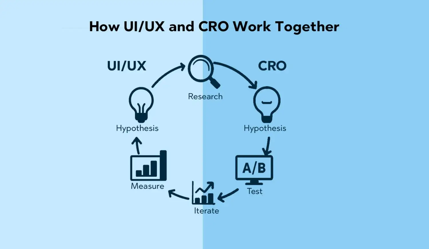
UI/UX and CRO aren’t competing disciplines. They’re two sides of the same coin.
● UI/UX ensures your landing page is usable, appealing, and aligned with user intent.
● CRO ensures those good experiences translate into measurable actions and revenue.
A typical improvement loop might look like this:
Over time, this loop compounds your gains and steadily increases landing page conversion rate.
If you’re ready to turn your landing pages into always-on growth assets instead of static brochures, partnering with a specialist team through conversion rate optimization services can accelerate that journey.
UI (User Interface) is about the visual layer of your site—colors, fonts, buttons, layout, and imagery. UX (User Experience) is about how users feel when they interact with your site – how easily they find information, how smooth the flow is, and how quickly they can complete tasks.
You need both if you want to improve landing page conversions. UI attracts, UX retains, and converts.
Good UI/UX reduces friction and builds trust.
● Clear messaging and layout help users understand your offer.
● Intuitive navigation and forms make it easy to take action.
● Fast, mobile-friendly pages keep users from abandoning the experience.
When you remove pain points and make the path to conversion obvious, more visitors complete the desired action.
There’s no universal “magic” color that guarantees conversions. What works depends on your brand, audience, and context.
However:
● Use high contrast between your CTA and background.
● Reserve your strongest accent color for primary buttons.
● Ensure sufficient contrast for text to stay readable.
Test different color options for CTAs and key elements as part of your landing page optimization tips. Let data guide you.
Critical. For many brands, mobile visitors make up the majority of traffic. If your landing page isn’t responsive, loads poorly, or breaks on mobile, your conversion rate will suffer dramatically.
Prioritize:
● Responsive design that adapts to different screen sizes
● Thumb-friendly navigation and CTAs
● Fast load times on mobile networks
If you’re wondering how to improve landing page conversions fast, mobile responsiveness is a great place to start.
Focus on clarity and simplicity.
● Limit the number of top-level menu items.
● Use descriptive labels like “Pricing” or “Resources” instead of vague terms.
● Keep high-priority actions within one or two clicks.
● Use breadcrumbs on multi-step flows or complex content structures.
The easier it is to move through your site, the more likely users are to reach conversion points.
CTAs are the bridge between interest and action. Without clear, compelling CTAs, even the most beautiful landing page will struggle to convert.
Strong CTAs:
● Make the next step obvious
● Communicate value (“Get the Guide”, “Book a Demo”)
● Appear multiple times along the user journey
● Stand out visually
Treat CTAs as core assets in your landing page design for conversions, not as an afterthought.
There’s no fixed schedule, but you should review and iterate regularly.
Update when:
● You see conversion rates drop or plateau
● You launch new offers or reposition your brand
● User behavior data reveals friction points
● New devices or UX patterns become standard (for example, more users on mobile or tablet)
Instead of massive redesigns every few years, aim for continuous, smaller improvements guided by CRO insights.
User behavior tools give you an inside view of how people actually use your pages.
Popular categories include:
● Heatmaps & recordings – Hotjar, Crazy Egg
● Analytics – Google Analytics / GA4
● A/B testing – Optimizely, VWO
● Speed performance – Google PageSpeed Insights, Lighthouse
Combine these tools and you’ll have a powerful toolkit to guide your UI/UX and CRO decisions.
Slow pages frustrate users. Frustrated users bounce.
Page speed affects:
● First impressions
● Bounce rates
● Time on page
● Ultimately, your conversion rate
Faster pages feel smoother and more reliable. Users are more likely to complete forms, check out, or request demos when the experience feels instant and responsive.
Some of the most common conversion-killing mistakes include:
● Cluttered layouts with too many messages at once
● Weak, generic, or hidden CTAs
● Slow loading on mobile
● Inconsistent use of fonts, colors, and button styles
● Confusing navigation or broken flows
● Forms that ask for far too much information
Avoid these pitfalls, and you’ll already be far ahead in your quest to increase landing page conversion rate.