
Rahul Guleria
SEO Executive
Creative,
Branding
& Growth
in the Global
Digital Ecosystem
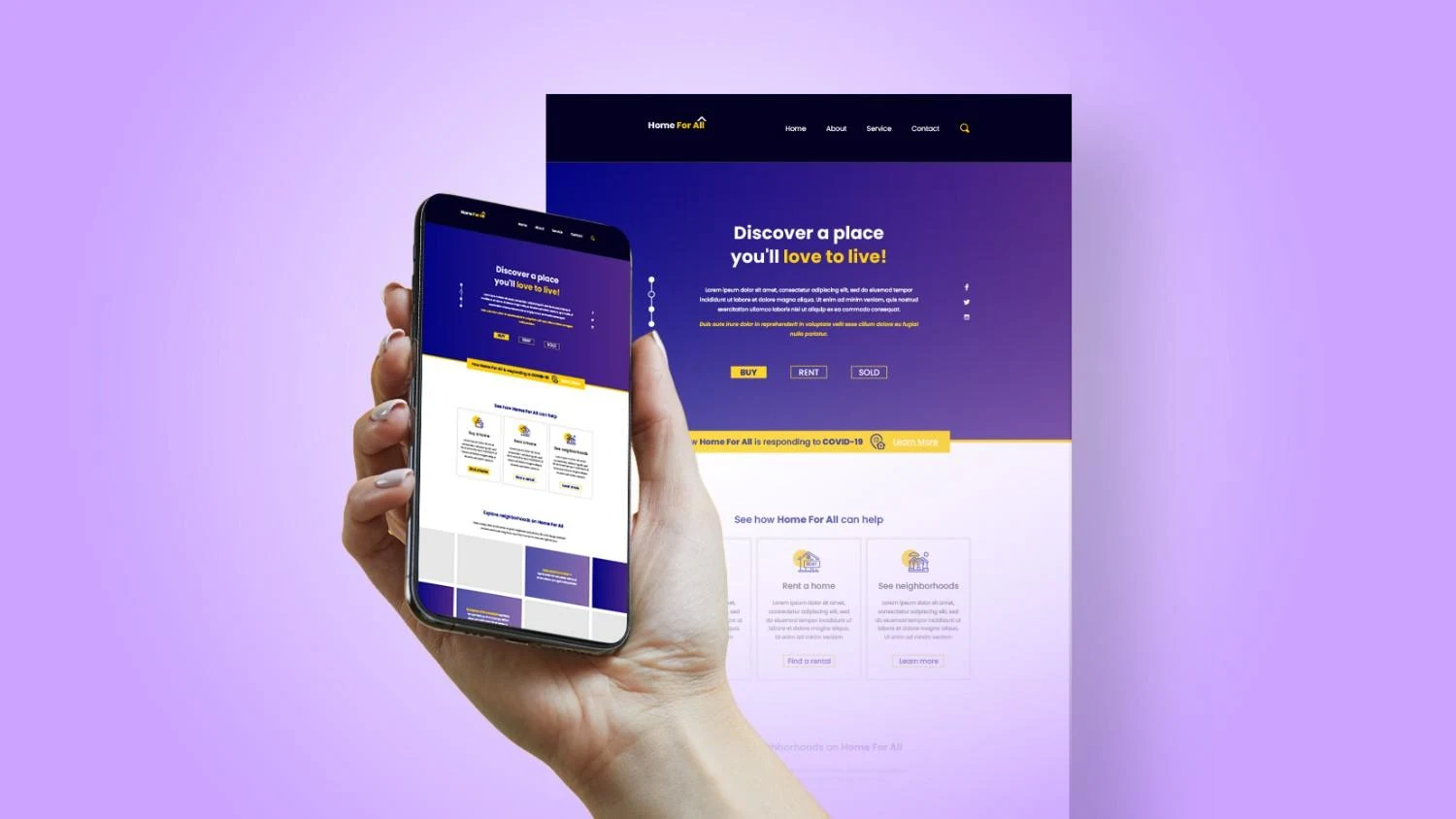
Landing page conversions can be improved by combining clear messaging with user-centric design. Focus on benefit-driven headlines, strategic CTA placement, strong visual hierarchy, fast page speed, persuasive social proof, mobile responsiveness, and ongoing A/B testing. When design, copy, and data work together, you significantly increase the landing page conversion rate and ROI.
You can drive all the traffic in the world to your website, but if visitors don’t take action, that traffic is just an expensive vanity metric. Conversions are the moment interest turns into value:
● A newsletter signup
● A booked demo
● A product purchase
● A download or registration
Your landing page is where that decision happens. Done well, it quietly nudges people to say “yes”. Done poorly, it leaks revenue like a bucket full of holes.
That’s why marketers obsess over how to improve landing page conversions. Even a small uplift can have a huge impact. Boosting conversion rate from 3% to 4.5% means 50% more results from the same traffic and ad spend.
Before we dive into landing page optimization tips, let’s clarify exactly what we’re trying to improve.
A landing page conversion happens whenever a visitor completes the main action you designed the page for. That action might be:
● Completing a purchase
● Submitting a lead form
● Booking a consultation
● Signing up for a webinar
● Downloading a gated resource
If it moves the user one step closer to revenue or a qualified lead, it counts as a conversion.
Landing pages usually sit in the middle of your marketing funnel, right after an ad click, email link, or social post. At this stage, users already showed some intent. Conversions here:
● Turn paid clicks into revenue
● Lower your cost per lead or sale
● Improve ROAS and marketing efficiency
● Give you data to refine targeting and messagingWhen you increase the landing page conversion rate, every other channel suddenly looks smarter and more effective.
Many businesses make one big mistake. They drive traffic to their homepage instead of a focused landing page.
● A homepage is like the lobby of a building. It introduces the brand and offers multiple routes: services, blog, careers, contact, etc.
● A landing page is like a private meeting room. It focuses on one message, one audience, and one main action.
If you want higher conversions, don’t send campaign traffic to a noisy lobby. Send it to a dedicated room designed specifically for that visitor and their intent.
Let’s break down the main ingredients behind landing page design for conversions. You’ll see these themes repeating through most high-performing pages.
Your headline is your first impression. Visitors take seconds to decide whether to stay or bounce.
Great headlines:
● Are benefit-driven, not just descriptive
● Make it obvious who the page is for
● Speak directly to a pain point or desired outcome
Example contrast:
● Weak: “Marketing Automation Software.”
● Strong: “Automate Your Marketing and Close 30% More Deals.”
The subheadline supports the promise by adding detail or proof. Together, they answer: “Why should I care?”
Your call-to-action is the goalpost. Everything on the page should point toward it.
CTAs perform best when they:
● Use action verbs (“Get”, “Start”, “Book”, “Download”)
● Highlight value (“Get My Free Audit”, “Start My 14-Day Trial”)
● Appear above the fold and at logical points down the page
● Stand out visually with contrasting color and whitespace
If users have to hunt for what to do next, you’ll lose them.
Page speed is often the silent killer.
Slow pages:
● Increase bounce rates
● Lower user trust
● Hurt SEO and ad performance
A fast page feels modern and reliable. It’s also one of the easier technical levers you can pull when you’re looking for quick landing page optimization tips.
For many industries, more than half of visitors come from mobile devices. If your landing page doesn’t render correctly on a phone, your conversions will nosedive.
Mobile-ready pages:
● Use responsive layouts
● Keep tap targets large and spaced out
● Avoid tiny text and cramped forms
● Load quickly on mobile networks
If you want to increase landing page conversion rate, mobile UX simply isn’t optional.
Visitors constantly ask themselves, “Can I trust this?” Trust signals help them say “yes”.
Examples include:
● Testimonials and reviews
● Star ratings
● Case study highlights
● Client or partner logos
● Money-back guarantees
● Security badges and safe checkout icons
Powerful social proof shows that people like them already took the leap and had a good experience.
Forms are where conversions live or die.
Long, complicated forms create friction. Users hesitate. Some quit.
Better forms:
● Ask only for the information you truly need
● Use clear labels and inline error messages
● Group related fields logically
● Indicate progress on multi-step forms
Every field you remove makes a conversion more likely.
Design doesn’t just make things pretty. It tells users where to look and how to feel.
● Clean layouts with plenty of whitespace feel calm and professional
● Clear visual hierarchy guides users from headline → benefits → CTA
● Contrasting colors draw attention to buttons and key messages
● Imagery that reflects your users or outcomes helps them imagine successStrategic design decisions become some of the most reliable CRO tips for landing pages when you pair them with data.
Now let’s turn strategy into action. Here’s a practical roadmap for how to improve landing page conversions without guessing.
Your headline is the best place to start.
Make it benefit-driven
Talk about the outcome, not just the product.
● “Get More Booked Calls from Your Ad Spend.”
● “Turn Website Visitors into Qualified Leads in 7 Days.”
Keep it clear, concise, and specific
Avoid buzzwords and vague promises. Clarity converts.
You can brainstorm several headline options, then test them against each other using a structured Conversion Rate Optimization approach. If you want help building proper tests rather than gut-feel edits, you can explore PulsePlay Digital’s Conversion Rate Optimisation services for a more data-driven process.
Think of CTAs as mini sales pitches in a single line.
Use strong action verbs
Lead with action that implies value:
● “Get My Free Strategy Session.”
● “Download the Playbook.”
● “Start My Free Trial.”
Place CTAs above the fold and at key points
At minimum, include CTAs:
● In the hero section
● After your core benefits
● Near testimonials or case studies
● At the end of the page
Users should never scroll far without seeing the next step.
Test different CTA colors and styles
Sometimes a simple change like moving from a muted button to a bold accent color can dramatically increase clicks. Just be sure the new color still fits your brand and remains accessible.
Every extra field is a mini obstacle between your visitor and conversion.
Ask only what you need
If you don’t absolutely need “Company Size” or “How Did You Hear About Us?” to follow up effectively, consider dropping those fields or making them optional.
Reduce friction
● Use clear field labels rather than placeholder text alone
Sometimes switching a long single-page form into a short two-step flow can boost conversion because it feels less overwhelming.
You’ll never regret making your site faster.
Compress images
Large images slow everything down. Use appropriately sized images and modern formats where possible.
Minimize scripts
Too many third-party scripts (chat widgets, tracking tags, pop-ups) can cripple performance. Audit which ones you truly need.
Ensure responsive design
Test your landing page on multiple screen sizes and devices. Check:
● Are text and CTAs easy to read and tap?
● Do forms work smoothly?
● Are any elements overlapping or cut off?
Fixing these issues alone can significantly increase landing page conversion rate.
People trust people more than they trust brands.
Types of social proof that work well:
● Short testimonials with names, roles, and photos
● Case study snippets (“Increased conversions by 40% in 3 months”)
● Review ratings or award badges
● Logos of well-known clients or partnersPlace social proof close to CTAs. This reassures users right before they make a decision.
You might think a new design or headline is better, but your audience decides.
That’s where A/B testing comes in.
What to test:
● Headlines and subheadlines
● Hero images or background imagery
● CTA copy, color, and placement
● Form length and structure
● Social proof placement and format
Run tests long enough to collect meaningful data rather than reacting to small early swings. Then, keep the winning variation and plan the next test. Over time, small consistent lifts compound.
To understand the bigger strategic picture behind testing, you can read What is Conversion Rate Optimization (CRO) and see how landing page tests fit inside a broader CRO program.
Your value proposition answers the question: “Why should I choose you right now instead of any other option?”
To clarify it:
● Explain the primary benefit in one line
● Highlight what makes your offer different or better
● Emphasize urgency where appropriate (“Limited seats”, “Offer ends Friday”)
Features tell; benefits sell. Instead of “24/7 support”, say “Get help from a real human whenever you need it”.
Make sure your value proposition is visible above the fold and then reinforced through the rest of the page.
Design can support or sabotage your message.
Direct attention to the CTA
● Use contrasting colors for main buttons
● Surround CTAs with whitespace
● Use directional cues (arrows, images of people looking toward the CTA, etc.)
Avoid clutter
Resist the urge to cram everything into one screen. Give content space to breathe. If something doesn’t reinforce your main goal, remove it or move it below the fold.
Use contrasting colors strategically
Your CTA should ideally be the most visually dominant element on the page. That doesn’t mean neon overload, just smart use of contrast compared to the background and surrounding elements.
You can’t improve what you don’t measure. Thankfully, you don’t need a huge stack of software to get started.
Analytics tools show you:
● Overall conversion rates
● Traffic sources and which ones convert best
● Drop-off points in your funnel
Look especially at:
● Conversion rate by device (desktop vs mobile)
● Conversion rate by source (paid, organic, social, email)
● Behavior flows (how users move through your site)
This data helps you prioritize which landing pages and segments to optimize first.
Heatmaps show where users click, scroll, and ignore. Session recordings let you watch actual journeys.
You can spot:
● Elements people think are clickable but aren’t
● Sections users rarely scroll down to
● Confusing layouts that cause rage-clicking
These insights guide more targeted landing page optimization tips.
Testing platforms help you:
● Split traffic between different versions of a page
● Track which version converts best
● Run controlled experiments without needing constant code deployments
A/B testing turns “I feel like this is better” into “We know this version increased conversions by 18%”.
Dedicated landing page tools often provide:
● Built-in templates designed for conversions
● Drag-and-drop editors for quick iterations
● Native analytics and testing features
Whether you build pages in-house or on a platform, the key principle stays the same: test, learn, and iterate.
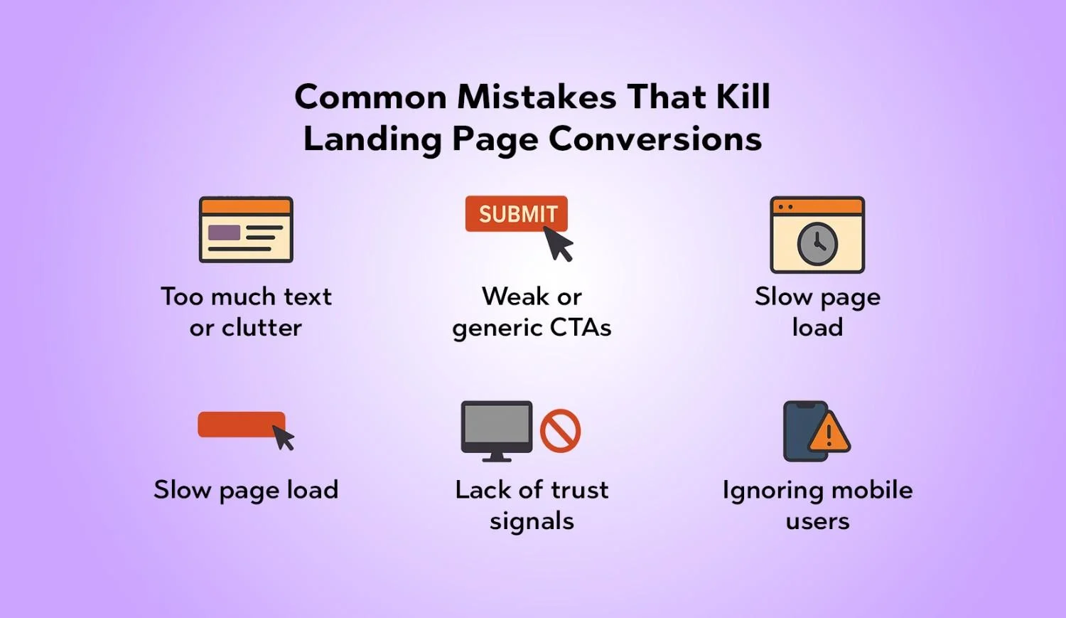
Walls of text scare people away. So do crowded layouts.
To fix this:
● Break copy into short paragraphs and bullet points
● Use headings and subheadings to create structure
● Remove any element that doesn’t support the main goal
Minimal doesn’t mean empty. It means intentional.
“Submit” is not a persuasive CTA. It doesn’t tell users what they get or why they should click.
Upgrade your CTA copy to communicate clear value and next steps. This small change often drives a noticeable uplift.
We’ve mentioned speed a few times because it really is that important.
● Compress images
● Lazy-load non-critical media
● Trim unnecessary tracking scripts
Every second saved reduces the number of visitors who leave before even seeing your offer.
A beautiful design without any proof feels risky.
If you don’t have testimonials yet, start small:
● Short quotes from internal stakeholders or beta users
● Number of customers served or industries worked with
● Simple statements about your guarantees or policies
Then build up your library of case studies and reviews as you grow.
If your team only reviews designs on a large monitor, you’ll miss the reality of how many people experience your landing page.
Always review prototypes and live pages on real phones. If something feels awkward on mobile, fix it before you worry about subtle desktop tweaks.
Improving a single landing page is great. Building a repeatable system for improvement is even better.
That’s where Conversion Rate Optimization comes in. It’s not just about one redesign. It’s about:
● Understanding user behavior deeply
● Developing hypotheses backed by data
● Running experiments to validate those ideas
● Rolling out winners and planning the next tests
If you want a partner to help you build that system instead of tackling isolated tweaks, PulsePlay Digital’s Conversion Rate Optimisation service is designed for exactly that.
For a deeper strategic primer, you can also read What is Conversion Rate Optimization (CRO) and connect all these landing page tactics with a full-funnel growth approach.
Learning how to improve landing page conversions isn’t about chasing hacks or copying the latest design trend. It’s about understanding your audience, communicating a clear value proposition, and removing every bit of friction between interest and action.
Start with:
● A sharper headline
● Stronger CTAs
● Cleaner forms
● Faster load times
● Honest social proof
Then layer in testing and Conversion Rate Optimization to refine your page month after month. Do that consistently and your landing pages stop being static brochures. They become living, evolving revenue engines for your business.
It varies by industry, traffic source, and offer. Some pages convert at 2–3%, others at 15–25% or higher. Instead of chasing a universal “good” number, benchmark your current performance and aim for continuous improvement using structured CRO.
Focus on three things:
Then, A/B test different versions to see what resonates best.
Absolutely. Slow pages frustrate users, especially on mobile. Many people will abandon a page that takes more than a few seconds to load. Faster pages create a smoother experience, which naturally leads to higher conversion rates.
As few as possible while still allowing you to follow up effectively. For a top-of-funnel lead magnet, name and email might be enough. For a sales-qualified demo request, you can ask for a bit more detail. As a rule of thumb, if a field doesn’t directly help qualify or serve the lead, consider removing it.
There’s no single “best” headline. However, winning headlines typically:
● Clearly describe the main benefit
● Speak directly to the target audience
● Use simple, direct language
Create multiple headline options and test them. Let performance data, not personal preference, decide the winner.
Testimonials reduce perceived risk. When visitors see that real people like them achieved real results, they feel more confident taking action. They reassure potential customers that your promises have been fulfilled before.
Yes, and in many cases it’s the most important thing you can do. With so much traffic coming from mobile, a page that doesn’t work well on phones will leave a lot of money on the table.
Think of testing as an ongoing habit, not a one-off project. As long as you have enough traffic to reach statistically meaningful results, you should always have at least one active test running—whether it’s headline, CTA, layout, or pricing.
You can start with:
● An analytics platform such as GA4 for conversion tracking and funnel analysis
● Heatmap and session recording tools to visualize behavior
● A/B testing platforms to run experiments
The exact combination depends on your tech stack, but the goal is the same: see what users do, experiment with improvements, and measure the impact.
Visuals can significantly boost engagement when used well.
● Images that show the product in action or represent your audience help visitors picture themselves using your solution.
● Videos can quickly explain complex offers, demonstrate features, or showcase testimonials.
Just make sure the media doesn’t slow your page to a crawl. Always balance visual impact with performance.