
Rahul Guleria
SEO Executive
Creative,
Branding
& Growth
in the Global
Digital Ecosystem
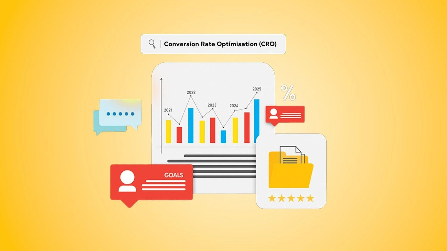
Conversion Rate Optimisation (CRO) is all about turning more of your existing visitors into leads or customers. When you avoid costly conversion rate optimization mistakes, every click you pay for and every visitor you attract works harder for your business.
This guide walks through the most common CRO mistakes to avoid, how they damage performance, and the CRO best practices that help you fix them for good.
Conversion Rate Optimisation (CRO) is the process of improving your website or landing pages so a higher percentage of visitors take a desired action. That action could be:
● Filling out a form
● Making a purchase
● Booking a demo
● Downloading a resource
● Subscribing to your newsletter
CRO focuses on what happens after someone lands on your page. Instead of just driving more traffic, you improve how effectively your existing traffic converts.
If you’re new to the topic, it’s worth first understanding the foundations in detail with this article on what is conversion rate optimization (CRO) is.
Small improvements in conversion rates can create big gains in revenue because they affect every visitor:
● A store with 10,000 monthly visitors and a 2% conversion rate generates 200 sales.
● If CRO work bumps that rate to 3%, the same traffic now delivers 300 sales.
You didn’t spend extra on ads. You simply fixed conversion rate optimization mistakes on your site.
That’s why businesses invest in Conversion Rate Optimization as a core growth lever. Done well, it lowers your cost per acquisition, increases ROI on marketing, and turns your website into a consistent revenue engine.
Let’s dive into the CRO mistakes on websites that quietly kill conversions and how to spot them.
One of the biggest and most common CRO mistakes to avoid is ignoring user intent. User intent is the reason someone came to your page in the first place.
When there’s a mismatch between the traffic source and the landing page, visitors feel misled and bounce quickly.
Examples:
● An ad promises “Free SEO Checklist,” but the landing page pushes a paid audit with no checklist in sight.
● Someone searches “how to fix slow WordPress site” and lands on a page that only talks about generic hosting plans.
In both cases, the user intent is clear. They want something specific. If your content and offer don’t match that intent, they leave… fast.
How to avoid this:
● Align each ad group or campaign with a dedicated landing page.
● Use the same keywords and core promise from your traffic source on the page.
● Make sure the main headline answers the “Why am I here?” question in a split second.
When intent and content line up, visitors feel they’re in the right place and are far more likely to convert.
You’d be surprised how many websites forget to tell visitors what to do next. Vague or hidden CTAs are classic conversion rate optimization mistakes.
Common examples:
● Buttons that say “Learn More” or “Click Here” without context.
● Important CTAs buried below the fold or lost in a busy design.
● Multiple CTAs that compete with each other on the same page.
If visitors have to think about the next step, they often won’t take it.
What to do instead:
● Use action-driven, specific labels: “Get Free Quote”, “Book a Demo”, “Download the Guide”.
● Make primary CTAs visually distinct and easy to find.
● Keep one main CTA per page or per section to reduce confusion.
Clear CTAs reduce friction and guide users along the path you’ve designed, instead of leaving them to guess.
Slow pages kill conversions. People have little patience for sites that take forever to load.
Impact of slow load times on conversions:
● Visitors abandon pages that don’t load within a few seconds.
● Cart abandonment shoots up if checkout pages lag.
● Paid campaigns waste money if users bounce before seeing the offer.
Page speed affects both user experience and SEO, so it’s not just a technical issue, it’s a revenue issue.
Typical culprits:
● Unoptimised large images
● Too many third-party scripts
● Bloated themes or plugins
● Poor hosting performance
Improving speed is one of the fastest ways to recover lost conversions and create a smoother user journey.
More information doesn’t always mean more clarity. In fact, overloading pages with text, options, and distractions causes cognitive overload.
When users face too many choices or too much content:
● They feel overwhelmed.
● They struggle to find what matters.
● They delay decisions or leave altogether.
You see this on landing pages:
● Have multiple competing offers.
● Display long, unstructured blocks of text.
● Include navigation menus, sidebars, pop-ups, and carousels all at once.
The brain likes simplicity. CRO best practices lean towards focused pages that present one main idea and one strong action.
Ignoring mobile optimisation is one of the most damaging CRO mistakes on websites, especially today when a large portion of traffic comes from smartphones.
Common mobile issues:
● Buttons too small or too close together.
● Text that requires pinching and zooming.
● Forms that are hard to fill out on a small screen.
● Elements that break or overlap on mobile view.
When your site isn’t mobile-friendly:
● Bounce rates climb.
● Form completions drop.
● Mobile shoppers abandon carts at higher rates.
A mobile-first CRO mindset means:
● Designing for mobile screens first, then scaling up to desktop.
● Testing all key conversion paths on real devices.
● Simplifying layouts and interactions for thumb-friendly use.
Headlines are often the first thing visitors read, so they make or break your conversion rate.
Generic or weak headlines:
● Don’t communicate value.
● Don’t connect to user intent.
● Don’t create curiosity or urgency.
Examples of weak headlines:
● “Welcome to Our Website.”
● “We Provide Marketing Services.”
● “Best Company in the Industry.”
These statements don’t tell the visitor what’s in it for them or why they should care.
Stronger, value-driven headlines:
● Speak directly to the outcome: “Increase Online Sales Without Increasing Ad Spend”.
● Address specific pain points: “Stop Losing Leads on Your Website”.
● Include clear benefits: “Turn More Traffic into Customers with Data-Driven CRO”.
Great headlines hook attention and set the tone for the rest of the page.
Another classic conversion rate optimization mistake is relying on gut instinct alone. Making changes based on opinions instead of data can lead to costly missteps.
Without A/B testing:
● You don’t know which headline, layout, or offer works best.
● You might roll out a “prettier” design that actually converts worse.
● You can’t quantify the impact of your CRO work.
A/B testing lets you:
● Compare two versions of a page or element.
● See which one drives higher conversions.
● Make decisions based on real user behaviour, not assumptions.
Skipping A/B tests is like flying blind. You might get lucky occasionally but you won’t be able to scale results reliably.
Your analytics are a goldmine. Not using them is one of the most avoidable CRO mistakes.
Key types of data to track:
● Traffic sources: Where visitors come from and which channels convert best.
● Behaviour metrics: Time on page, scroll depth, exit pages.
● Conversion funnels: Where users drop off in the process.
Beyond standard analytics, user behaviour tools show how people interact with your site:
● Heatmaps: Visualise where users click, move, and scroll.
● Session recordings: Replay real sessions to watch users’ journeys.
● Funnels: Track which steps users take before converting or dropping off.
Ignoring this data means you’re guessing at the problems instead of seeing them clearly.
Complicated forms and clunky checkout flows create friction at the most critical point – right when visitors want to convert.
Common issues:
● Too many mandatory fields.
● Asking for information you don’t actually need.
● Multi-step forms with no clear progress indicator.
● Confusing error messages or field validations.
In e-commerce, checkout mistakes include:
● Forced account creation before purchase.
● Hidden costs revealed only at the final step.
● Limited payment or delivery options.
Every extra click, field, or surprise increases the chance of abandonment.
Optimising forms and checkout flows is one of the quickest wins in CRO.
Even if everything else looks good, users still ask a silent question: “Can I trust this brand?”
A lack of trust signals is a subtle yet powerful CRO mistake.
Trust signals include:
● Customer reviews and star ratings.
● Testimonials with names and, if possible, photos or company names.
● Case studies that showcase real results.
● Security badges or certifications.
● Clear contact details and about information.
When these are missing, visitors may hesitate to submit their details or make a payment, especially if they don’t know your brand yet.
Adding credibility to your pages reduces anxiety and increases conversions.
All of these conversion rate optimization mistakes share a common outcome: they make it harder for users to say “yes”.
When visitors don’t see what they expected, face slow pages, or feel overwhelmed, their engagement plummets. They:
● Scroll less.
● Click less.
● Consume fewer pieces of content.
Low engagement tells search engines and ad platforms that your page isn’t satisfying users, which can also hurt traffic over time.
Many CRO mistakes on websites directly increase bounce rate:
● Misaligned intent = bounce.
● Weak headlines = bounce.
● Poor mobile experience = bounce.
High bounce rates mean you pay for clicks that never have a chance to convert. You’re essentially pouring traffic into a leaky bucket.
Every friction point is a potential lost sale or lead:
● Confusing CTAs mean visitors don’t take the next step.
● Complicated forms cause users to abandon halfway through.
● Lack of trust signals pushes cautious buyers elsewhere.
Over weeks and months, the revenue lost to CRO mistakes dwarfs the cost of fixing them.
Fixing CRO issues starts with a mindset shift. Instead of asking “How do we make this page look nicer?” ask “How do we make this page easier to say yes to?”
A user-focused approach means:
● Understanding your audience’s goals and pain points.
● Mapping their journey from first click to final conversion.
● Removing obstacles and answering questions at each step.
Practical first steps:
When you design with users in mind, CRO mistakes become easier to spot and fix.
Data removes guesswork from conversion rate optimisation.
To adopt a data-driven approach:
● Set up proper tracking for key actions (form submissions, purchases, button clicks).
● Review analytics regularly for drop-off points.
● Use heatmaps and recordings to see how people actually use the site.
● Create hypotheses: “If we simplify this form, the completion rate will increase.”
● Validate them with A/B tests instead of rolling out changes blindly.
Combining user insight with data turns CRO into a repeatable process rather than one-off tweaks.
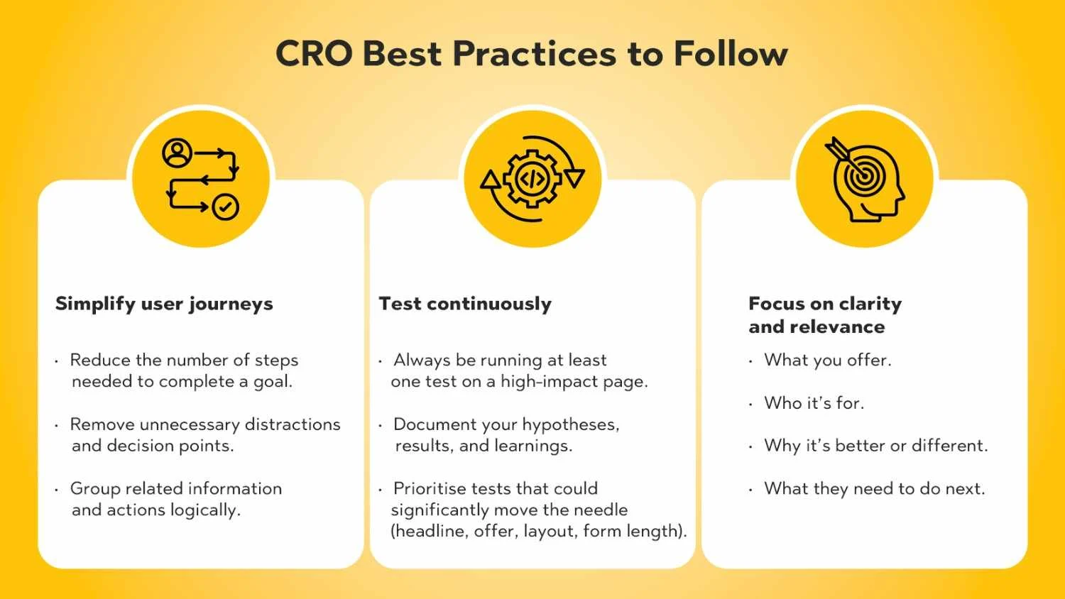
Once you’ve tackled the biggest issues, lean into CRO best practices that keep your site performing well over time.
Complex journeys often hide simple problems.
To simplify:
● Reduce the number of steps needed to complete a goal.
● Remove unnecessary distractions and decision points.
● Group related information and actions logically.
For example, if you want users to book a consultation:
Anything that doesn’t support that goal is a candidate for removal or relocation.
CRO isn’t a one-time project. Your audience, offers, and traffic sources evolve, so your website should evolve too.
Build a simple testing culture:
● Always be running at least one test on a high-impact page.
● Document your hypotheses, results, and learnings.
● Prioritise tests that could significantly move the needle (headline, offer, layout, form length).
Continuous testing transforms CRO from a guessy process into a growth engine.
Clarity beats cleverness in CRO.
Visitors should understand instantly:
● What you offer.
● Who it’s for.
● Why it’s better or different.
● What they need to do next.
Relevant content speaks directly to their situation and intent:
● Use the language your audience uses.
● Reflect the problems they’re trying to solve.
● Offer solutions that match where they are in the buying journey.
Clarity and relevance together make your pages feel made “just for them”, which is incredibly powerful for conversions.
You don’t need a huge tech stack to find conversion rate optimization mistakes, but a few key tools can make the process easier.
Analytics platforms show what is happening:
● Which pages do people visit most?
● What percentage converts or bounces?
● How different traffic sources perform.
● Identify underperforming pages.
● See where users drop out of your funnels.
● Measure the impact of changes and tests.
Behaviour tools show how it’s happening:
● Heatmaps highlight where users click, scroll, or ignore.
● Scroll maps show whether key information appears before users drop off.
● Session recordings reveal frustrating experiences like broken elements, repeated clicks, or confusion.
Together, analytics and behaviour tools give you a full picture of why conversions are low and where to focus your optimisation efforts.
CRO isn’t just about tweaking button colours. It’s about understanding visitors, giving them what they came for, and removing friction from every step of their journey.
To recap, the most common CRO mistakes to avoid include:
● Ignoring user intent and sending traffic to mismatched pages.
● Hiding or weakening your CTAs.
● Letting slow page speed hurt experience and revenue.
● Overloading pages with information and distractions.
● Neglecting mobile optimisation.
● Using generic, value-free headlines.
● Making decisions without A/B testing.
● Ignoring analytics and user behaviour data.
● Creating complicated forms or checkout processes.
● Failing to show trust signals that reassure visitors.
When you fix these conversion rate optimization mistakes, your existing traffic becomes far more valuable. You convert more leads and sales without necessarily increasing ad spend.
Most importantly, remember that CRO is ongoing. User expectations change, competitors improve, and your own offers evolve. Continuous optimisation keeps your website sharp, relevant, and profitable.
If you want expert help building and scaling a structured CRO programme, explore PulsePlay Digital’s Conversion Rate Optimization services to unlock more value from every visitor.
Some of the most common CRO mistakes to avoid are ignoring user intent, using vague CTAs, having slow page speed, neglecting mobile optimisation, overloading pages with information, and failing to show trust signals. Skipping A/B tests and not using analytics are also major issues.
CRO mistakes add friction and confusion to the user journey. They cause visitors to bounce earlier, abandon forms or carts, and hesitate when it’s time to take action. Over time, this leads to lower conversion rates, wasted ad spend, and missed revenue opportunities.
A/B testing lets you compare two versions of a page or element to see which one performs better. It removes guesswork and opinion from your decisions. Instead of assuming what works, you rely on real user data, making your optimisation efforts more reliable and scalable.
The single biggest mistake is making decisions without understanding the user. When websites ignore user intent and behaviour, they design pages that look good to the team but don’t help visitors achieve their goals. That disconnect shows up as low conversions.
Slow pages frustrate users and cause them to leave before they even see your content or offer. Page speed affects bounce rate, user experience, and even search rankings. Faster pages keep visitors engaged, reduce abandonment, and create a smoother path to conversion.
A large portion of traffic now comes from mobile devices. If your site is hard to use on a phone – small buttons, broken layouts, slow performance – users will quickly abandon. Mobile-friendly design ensures your CRO work benefits all visitors, not just desktop users.
Yes. Many CRO mistakes on websites, such as mismatched intent, weak headlines, slow load times, and poor mobile experience, directly increase bounce rate. When users don’t see immediate value or face friction early, they exit instead of exploring further.
Start with analytics to find pages with high traffic but low conversions or high bounce rates. Then use heatmaps and session recordings to see how users interact with those pages. Combine this data with user feedback and best practices to identify specific issues like poor CTAs, confusing layouts, or form friction.
Analytics platforms help you understand performance metrics like conversion rates and bounce rates. Heatmap and user behaviour tools show where users click, scroll, and get stuck. Together, these tools reveal CRO issues and guide your optimisation efforts.
CRO should be an ongoing process, not a once-a-year project. At a minimum, review key pages and funnels monthly, and aim to run continuous tests on your highest-impact pages. As your traffic and business grow, ongoing optimisation ensures your website keeps converting at its best.